Home » News & Resources » Transit Display/Digital Signage » How Transit Display Contributes to Accessibility

How Transit Display Contributes to Accessibility
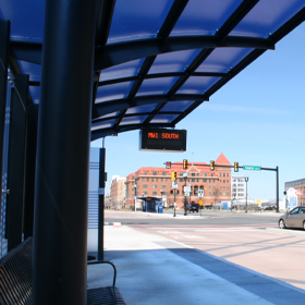
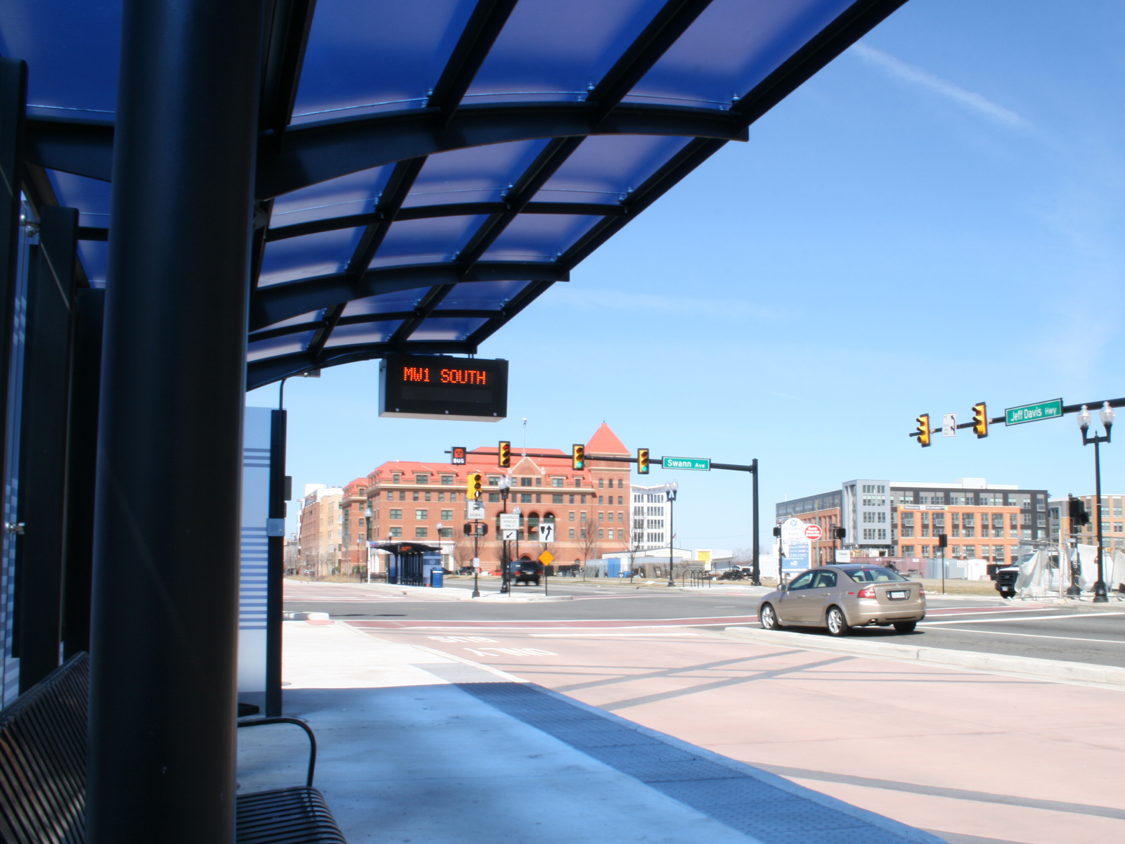
Transit Display screens are very helpful for commuters and riders; for those with disabilities, it is an additional tool that provides an extra layer of accessibility.
How Transit Display Contributes to Accessibility
Published: 05/18/2022

Transit Display screens are very helpful for commuters and riders; for those with disabilities, it is an additional tool that provides an extra layer of accessibility. Without a transit display screen available at a bus or train station, it would be more challenging for people with disabilities to get access to the information they need. A well designed transit screen can provide audio, captions and other additional tools to cover many of the needs of everyone.
The combination of audio and text in a transit display covers some of the disabilities. Other disabilities such as motor issues can be remediated by providing large buttons or other controls they can access, and provide enough time for them to make a selection on the screen.
In a transit display, there are many things that can help users with disabilities; such as providing any information on which elevators are wheelchair accessible, or buses that provide a wheelchair lift. This information may be available using GTFS, or General Transit Feed Specification. This provides transit companies with real-time data for their real-time applications, websites and even transit displays.
Location Is Everything
The location and placement of the transit display is also a key factor in its accessibility. Placing the display too high where people using a wheelchair cannot access it is one challenge. If the location of the screen is poorly lit, or hits the sun, also makes the transit display not that helpful
Other Things to Consider
The correct use of color and fonts are key for an accessible transit display. As with websites and other technology, fonts needs to be easy to read. Fonts such as Arial, Helvetica and Tahoma are easier to read, even from a distance. With colors, we have to keep in consideration also color blind users, by not assuming they can recognize colors. Some train stations have adopted the word of the color in their signs. For example, for the blue line, not only they have the color in their signs, but also the word "blue".
These, and many other factors need consideration when designing a transit display. At Redmon, we have a lot of experience with accessibility and following Section 508 guidelines; and we proudly put this experience into our transit displays.
Categories
Public TransitTransit Ridership
Mask Mandate
Commuters/Commuting
Transit Display/Digital Signage
Accessibility Commuter Rail
Recent Posts

Electric School Buses Driving Towards a Greener Future
Electric school buses are currently on high demand, and following the trend of public transit with the transition to clean energy.

Redmon Transit Display Expands Digital Signage Capabilities
Redmon's Transit Display, a leading provider of digital signage solutions for public transportation, is excited to announce the release of new features for its industry-leading digital signage system.